Sense & Scale

A site to explore cultures, cities, and computing at varying senses and scales. Updated by Ar Ducao, with content from classes at NYU, MIT, CUNY and more.

Contact: see syllabi

  •   Are there significantly more appearances of X-Men or Avengers characters in the Marvel Universe? Well, we haven’t quite answered the question, but this data and script play with the topic. Links and notes below: marvel0_modified.csv Notes: This csv contains data on the first 100 characters from the Marvel API (thanks…


    Are there significantly more appearances of X-Men or Avengers characters in the Marvel Universe? Well, we haven’t quite answered the question, but this data and script play with the topic. Links and notes below:

    • marvel0_modified.csv
      • Notes: This csv contains data on the first 100 characters from the Marvel API (thanks Sweta). Because the column names are difficult to parse (in that the special charater “/” is frequently used), I modified the 11th column name from “comics/items/0/name” to “firstcomicname.”
    • Marvel.R
      • If you run the entire script in R, you’ll see a comparison between characters classified as X-Men and characters classified as Avengers. I used a rough classification:
        • xmen = characters whose firstcomicname contains “X-Men”
        • avengers = characters whose firstcomicname contains “Avengers”

    I hope you can use this script to help form your own analyses for your final datasets!

    + ,
  • Announcements Please fill out now: potluck and +1s Final Grade Checklist, see below For screen-based projects: Research Science Knowledgebase: Analysis For tangible projects: Human-Centered Design Kit Looking for hardcore movie fans Agenda 6:30-6:45 Announcements and Updates 6:45-8:45 One-on-one sessions Tania van Bergen: General Storytelling Feedback Arlene: focus on Context/Analysis requirements, answers…

    Announcements

    Agenda

    • 6:30-6:45 Announcements and Updates
    • 6:45-8:45 One-on-one sessions
      • Tania van Bergen: General Storytelling Feedback
      • Arlene: focus on Context/Analysis requirements, answers for any remaining questions
    • 8:45 Class Evaluations

    Final Assignments

    1. Final presentations on December 10! I will post the order of presentations this weekend. Be prepared to present for 10-20 minutes, followed by 10-20 minutes of Q&A. I will issue a preliminary final grade on December 14.
    2. Final Grade Checklist
      • Final presentation + Interactive Visualization
      • Slideshow + 800 word paper + MLA bibliography of 5 works or more
      • 5 blog posts. If you have any unexcused absences, be sure to write an expanded post(s). Posts can include
        • Timeline.js experiments
        • Persona Design exercise and human-centered design
        • QGIS and threejs exercise
        • Your email about your final project (please post this to make it easier for me)
        • R exercise
        • Any physical computing experiments
        • Any other technical exercises
        • Any reflections on class and/or our guest speakers
    3. Final Grades will be issued on December 21. You will have about a week to update your work between Dec 14 and Dec 21.
    + ,
  • Announcements Kevin Miklasz sent a few more R notes. Final Requirements are now posted. Let me know if you have questions. Dec 3’s class will have a lot of work/feedback time in preparation for Dec 10. If you want to follow-along with today’s Arduino/Processing visualization tutorial, install the software listed…

    Announcements

    • Kevin Miklasz sent a few more R notes.
    • Final Requirements are now posted. Let me know if you have questions. Dec 3’s class will have a lot of work/feedback time in preparation for Dec 10.
    • If you want to follow-along with today’s Arduino/Processing visualization tutorial, install the software listed on the tutorial page.

    Agenda

    • 6:30-7:20 Richard The
    • 7:20-8:10 Peiqi Su
    • 8:10-8:20 Break. Start Playing with Prototypes.
    • 8:20-8:50 Prototype playtime.
    • 8:50-9:20 Class updates

    Links

    Assignment for Next Week

    1. Due Monday: Send me a SHORT (2-sentence) e-mail about your final plans. I will respond with some quick thoughts on Monday as well.
    2. Due Dec 3: Start your final project preparations and post your progress.
    + ,
  • From our R expert (R-xpert?) Kevin Miklasz. Thanks Kevin! Here is a link to an expanded sample file that shows some common functions I use, and is mostly focused on some graphing parameters I use a lot (at the bottom of the script). None of the graphing functions will work as…

    From our R expert (R-xpert?) Kevin Miklasz. Thanks Kevin!

    Here is a link to an expanded sample file that shows some common functions I use, and is mostly focused on some graphing parameters I use a lot (at the bottom of the script). None of the graphing functions will work as they use data sets that I can’t share, but students can at least see some common graphing parameters that can be adjusted and reuse bits of the code in their own visualizations. Also including a list of preloaded R colors, and this image shows how the pch values in plots corresponds to different shapes.
    I might have come down a little too hard on p values yesterday. They are still useful, and you should definitely test for p-values. But your process should look a bit like this:
    1. Is there a significant p-value? If yes, go on
    2. Do you have a large sample size? If no, you’re good with the p value! If yes, go on.
    3. So the difference is significant, but is it meaningful? Is there an external measure for meaningfulness that you can use? Or can you shift to a data mining approach that can use cross-validation? It’s definitely ok to explore your data initially with correlation tests and t-tests, but before making a strong claim that there’s some real pattern in your data, you probably want to do some analysis beyond just finding a significant p value. P values should sort of be “necessary but not sufficient” kind of thing.
    + , ,
  • For this week’s class, you can experiment visualizing a Twitter livestream by connecting Peiqi Su’s penis modules and other output device, to an Arduino. I’ve included sample code below and will expand this tutorial for those who are interested. The tutorial will assume basic understanding of Arduino and Processing, particularly installing libraries…

    For this week’s class, you can experiment visualizing a Twitter livestream by connecting Peiqi Su’s penis modules and other output device, to an Arduino. I’ve included sample code below and will expand this tutorial for those who are interested. The tutorial will assume basic understanding of Arduino and Processing, particularly installing libraries and differentiating between digital and analog signals.

    Software

    • Arduino
    • Processing
    • Temboo and Twitter4j libraries for Processing (download them zipped together here)

    Set up dev accounts with

    Sample Files

    • Arduino Code: ReceiveFromProcessing
    • Processing Code: Twitter4jTest. Be sure to replace the placeholder authentication strings with the access keys from your own Twitter account!
    • (optional) Processing Code: TwitterTemboo. Be sure to replace the authentication placeholders!

    Original Tutorials

    + , ,
  • Announcements Global Action Project seeks a Media History Timeline Coordinator to use Timeline.js with youth, as well as an Immigrant Video Youth coordinator. To start immediately! If you haven’t already, Install R. Download this sample stats file. Final Requirements are now posted. Let me know if you have questions. Agenda 6:30-7:30 Rafi Santos,…

    Announcements

    Agenda

    • 6:30-7:30 Rafi Santos, Indiana University / Mozilla Hive Research Lab
    • 7:30-8:30 Kevin Miklasz: Stats Tutorial with R
    • 8:30-8:40 Break
    • 8:40-9:20 Class Updates

    Links

    Mozilla Hive Visualizations: click on each image for a full-sized view.

    circos hive ok white

    bipartite_network 2

    collaboration_network_1

    temporal_network_1

    geospatial_network

    Assignment for Next Week

    1. Using R, try simple analysis on a dataset you might use for your final. Don’t worry if you run into issues; just do what you can and write up a post about it.
    2. If you have any physical computing kits (ie Arduino), bring them in to use next week. If you don’t, no problem, I’ll have extras.
    3. Keep thinking and preparing for your final project. All assignments after this week will be related to the final.
    + ,
  • Final, due December 10 Note: Evaluation keywords are highlighted in orange.  Develop an interactive visualization(s) of a significant dataset for a general audience with no previous knowledge of the data. If the visualization is online, it should be deployed on a standalone web page—do not use code playgrounds like JSFiddle or Codepen.…

    Final, due December 10

    Note: Evaluation keywords are highlighted in orange

    1. Develop an interactive visualization(s) of a significant dataset for a general audience with no previous knowledge of the data. If the visualization is online, it should be deployed on a standalone web page—do not use code playgrounds like JSFiddle or Codepen. The visualization should employ introductory text and titles as well as keys, colors, annotations, and any other other information needed for a user to understand the vis.
    2. Include a background write-up (at least 800 words on your blog is fine) with an MLA-formatted bibliography containing at least 5 scholarly articles. Be sure to address the following points in the write-up. I will evaluate your project based on these points:
      • NEW FOR THE FINAL:
        • If your vis uses the same data from the midterm, how is it an expansion on the work you did for the midterm? Is the expansion significant?
        • If your vis is screen-based, how did you conduct a simple statistical analysis on the data? Please calculate and discuss basic values including mean, min/max, range, and correlation. If applicable, also discuss significance and t-test results, etc.
        • If your vis is tangible, how did you conduct a persona design exercise to envision interaction scenarios for the system? (Alternatively, you can use other ideation exercises.)
      • How is your overall visualization significant, unique, and relevant to general audiences?
      • What is the data source? How is it significant?
      • What questions does your visualization help answer? What is the best medium for this representation? (i.e. poster, model, web page)
      • Please discuss prior work,  prototypes, or sketches for your visualization. It can be both others’ work (please cite them in your bibliography) and/or your own work. How have these predecessors refined your work for this project?
      • What is the subset of the general audience that could especially use or appreciate your visualization?
      • How is your visualization implemented? What technologies does it use?
      • How is your visualization meant to be used? What are the steps for a user to interact with your vis? 
      • Future Work: What are the next steps for refining this project?
    3. Create a slidedeck (of at least 9 slides) that explains the content in your write-up.
    4. Be prepared to give a 10-20 minute presentation of your slides and your visualization, followed by 10-20 minutes of Q&A.
    + ,
  • Announcements Download QGIS and (from QGIS) QGIS2threejs http://www.datasociety.net/ Obfuscation: A User’s Guide for Privacy and Protest Agenda 6:30-7:30 Austin Lee, CMU/Microsoft 7:30-8:00 Class updates 8:00-8:10 Break 8:10-9:20 MindRider, QGIS, three.js Links 3D GIS Examples MindRider 3D data visualizations: test01 (just downtown) test02 (all of Manhattan) test03 (just downtown, with color-coded buildings) test04 (downtown with attention-meditation data)…

    Announcements

    Agenda

    6:30-7:30 Austin Lee, CMU/Microsoft
    7:30-8:00 Class updates
    8:00-8:10 Break

    8:10-9:20 MindRider, QGIS, three.js

    Links

    3D GIS Examples
    Data and Tutorials
    QGIS Tips
    Other WebGL libraries

    Assignment for Next Week

    1. Finish one of today’s visualization exercises or start your own. Some ideas:
      • Visualize the provided MindRider data with 3D buildings.
      • VIsualize 3D buildings with another point-based dataset from NYC Open Data.
      • Use the QGIS2threejs documentation to visualize a Digital Elevation Model (DEM).
      • Use Jennifer Sta. Ines’s tutorial to conduct a simple statistical analysis in QGIS.
    2. Finals are due in about a month. The requirements will be similar to midterms, with a possible simple analysis component. Start thinking about it!
    3. Install R in preparation for next week’s class. Download this sample stats file.


    +
  • Here’s a link to the live visualization. And good news: this tutorial involves no coding! Background More soon. For now, you can learn about MindRider helmet and data at their respective web sites. Getting Started Download QGIS and install (from QGIS) the QGIS2threejs plugin. Obtain this tutorial’s data, which includes these vector shapefiles:…

    Here’s a link to the live visualization. And good news: this tutorial involves no coding!

    Background

    More soon. For now, you can learn about MindRider helmet and data at their respective web sites.

    Getting Started

    1. Download QGIS and install (from QGIS) the QGIS2threejs plugin.
    2. Obtain this tutorial’s data, which includes these vector shapefiles:
      • a MindRider sample dataset (800 points)
      • Manhattan’s buildings south of 14th street
      • the polygon I drew to clip the original NYC building footprints to just this region. Rendering all the buildings for the entire city could crash your browser.
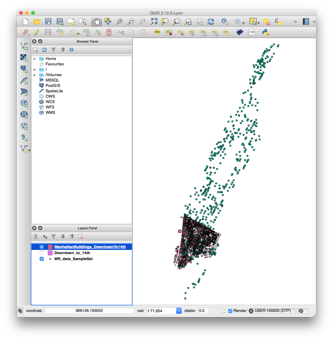
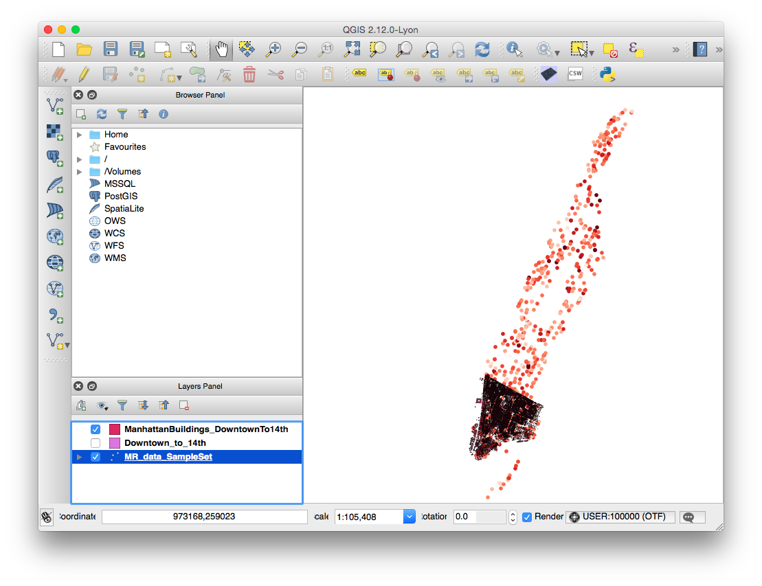
    3. In QGIS, add the MindRider data by navigating to Layer > AddLayer > Add Vector Layer. Add “MR_data_SampleSet.shp” from your tutorial data.
    4. NOTE: In your tutorial data folder, you’ll only be loading the shapefiles (.SHP extension). The other files (i.e. dbf, shx, etc) are supporting metadata for the shapefiles, so don’t remove them!
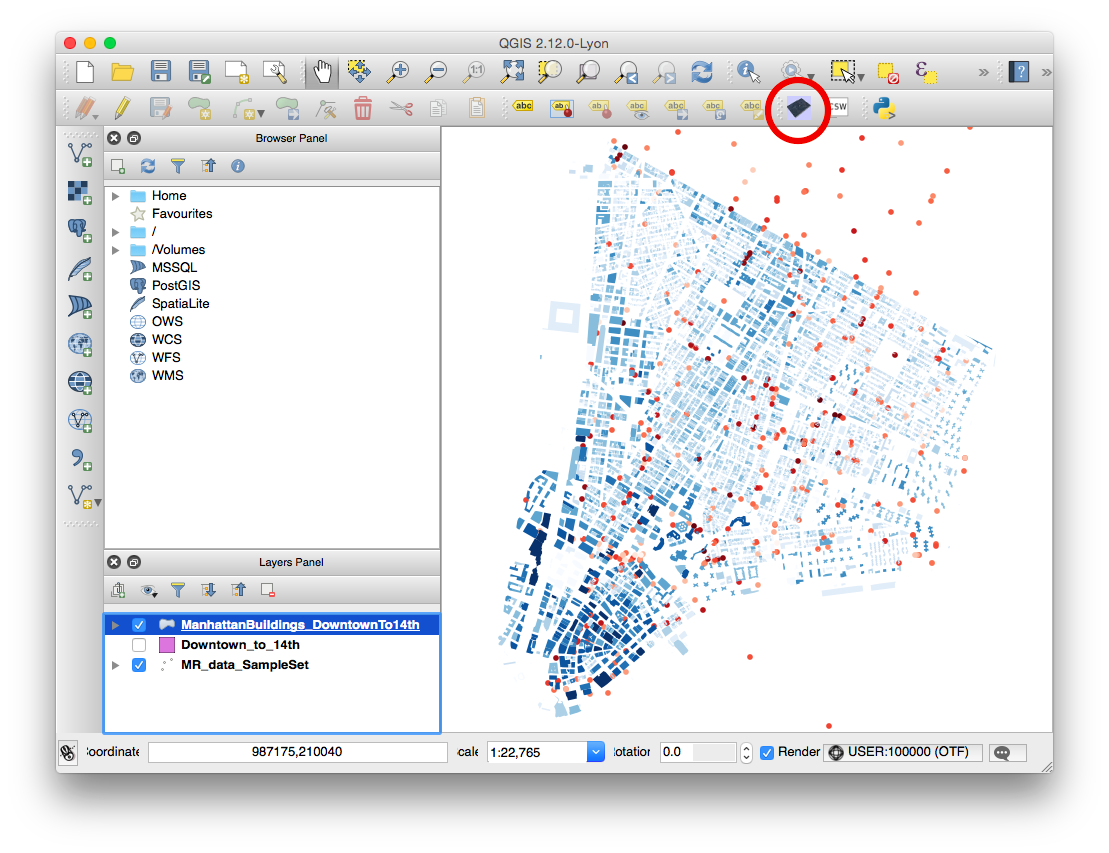
    5. Add the building by navigating to Layer > AddLayer > Add Vector Layer. Add “ManhattanBuildings_DowntownTo14th.shp” from your tutorial data. Your QGIS window should now look like this:
      Screen Shot 2015-11-05 at 3.13.59 PM
    6. NOTE: You can optionally add “Downtown_to_14th.shp” to your project to see what it looks like, but you won’t visualize it for the final render. If you’d like to crop another part of the building elevation data for your own purposes, see this link about creating polygons and this link about cropping shapefiles.
    7. NOTE: If you import the NYC Building Data directly from its source, you will need to re-project it. See this link for a note on the proper projection to use.

    Coloring the MindRider data

    In this section, we will color the MindRider data points varying levels of red based on the cyclist’s mental attention, from a range of 1-100.

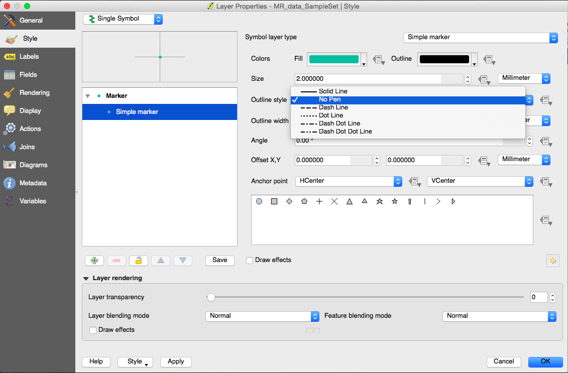
    1. In the Layers Panel, right-click MR_data_SampleSet and choose “Properties“.
      Screen Shot 2015-11-05 at 4.39.30 PM
    2. By default, the Properties window will be in the Style tab, and your marker type will be a Simple Marker. Remove the black outline from the markers by choosing No Pen from the Outline Style menu.
      Screen Shot 2015-11-05 at 4.46.24 PM
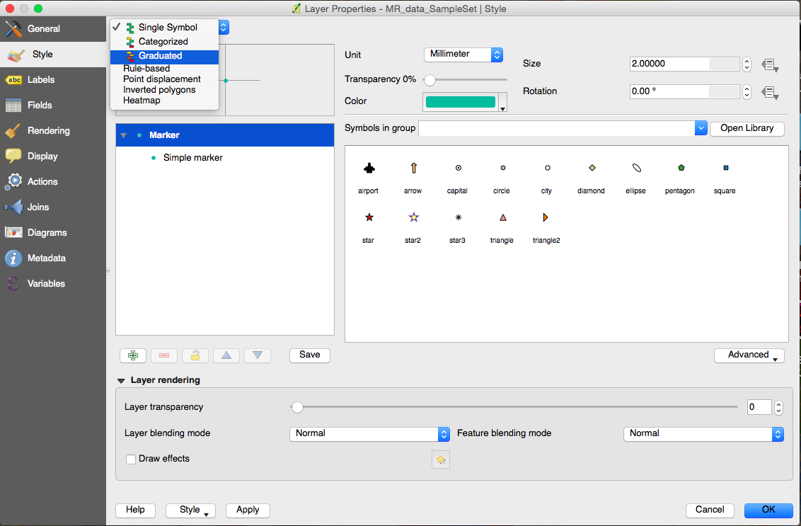
    3. Next, switch from “Single Symbol” to “Graduated Symbol” in the topmost menu.
      Screen Shot 2015-11-05 at 4.49.03 PM
    4.  Now change the following values:
      • COLUMN: eSenseAtte
      • COLOR RAMP: Reds
      • Classes: 100
        Screen Shot 2015-11-05 at 4.55.35 PM
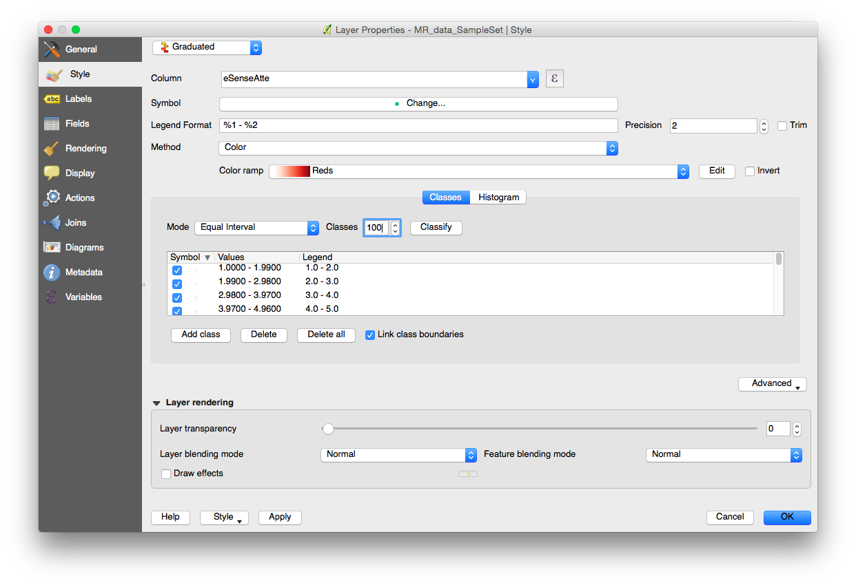
    5. Press OK, and the MindRider data should now be colored according to attention values.
      Screen Shot 2015-11-05 at 4.58.15 PM

    Coloring the NYC building data

    You don’t need to color the buildings according to height in order to extrude them with QGIS2threejs, but after an initial attempt without the color coding, I found it color to be a helpful aid in comprehending the visualization. I chose blue to contrast with the MindRider data, which is generally colored red-yellow-green.

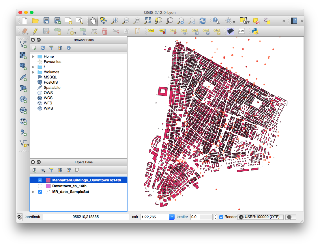
    1. In the Layers Panel, right-click ManhattanBuildings_Downtown_to_14th and choose “Zoom to Layer.”
      Screen Shot 2015-11-05 at 5.04.42 PM
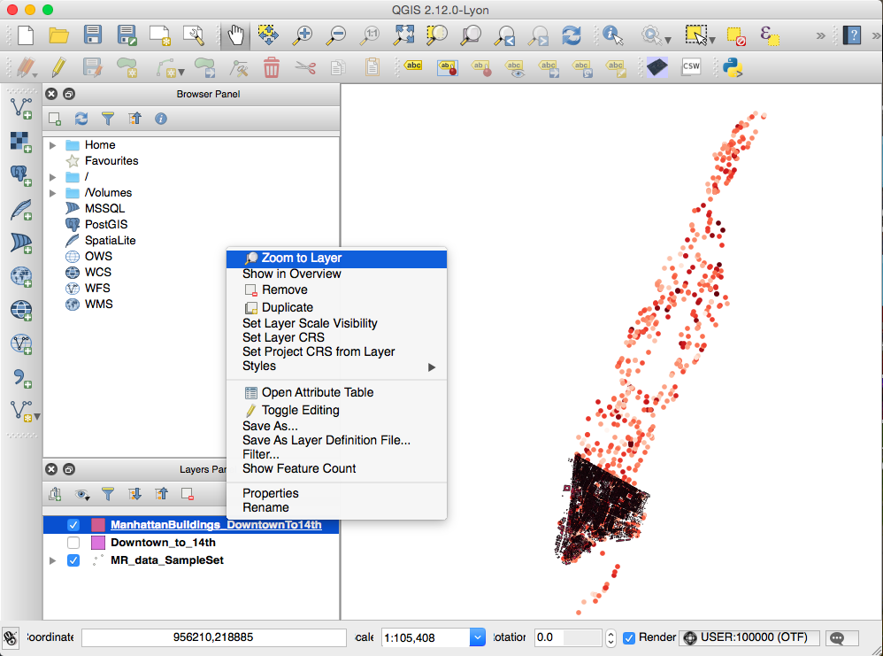
      Now you can see the layer more closely.
      Screen Shot 2015-11-05 at 5.05.01 PM
    2. Remove building footprint outlines using a similar method as used for the MindRider data:
      • In the Layers Panel, right-click ManhattanBuildings_Downtown_to_14th and choose “Properties“.
      • Remove the outline by choosing Simple Marker, then choose “No Pen” in the Border Style menu.
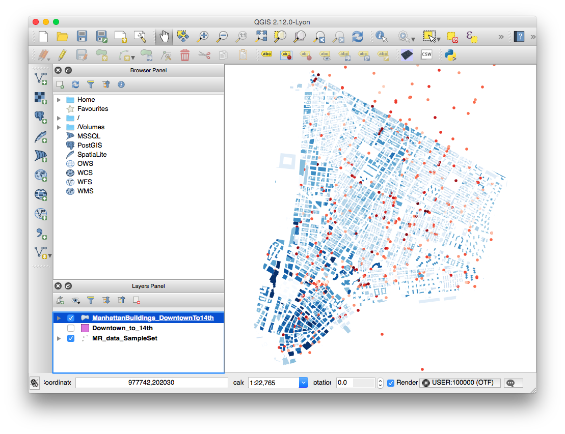
    3. Color the data a varying range by choosing Graduated in the top menu (just like you did with the MindRider data). Change these values:
      • Column: HEIGHT_ROO
      • Color Ramp: Blues
      • Mode: Natural Breaks (Jenks)
      • Classes: 10
      • Screen Shot 2015-11-05 at 5.15.32 PM
    4. Press OK and see that the building data is color-coded.
      Screen Shot 2015-11-05 at 5.17.07 PM

    Export (render) the data using QGIS2threejs

    Let’s try exporting this data to an HTML site.

    1. If you’ve installed QGIS2threejs, an icon for the plugin will show on the 2nd tier of tools in your window:
      Screen Shot 2015-11-05 at 5.21.16 PM
    2. NOTE: You will only choose the ManhattanBuildings for rendering via three.js. The MindRider data, since it’s visible in the QGIS project window, will be rasterized and displayed on a flat pane at the base of the extruded buildings. If you were to render the MindRider data as 3D objects, this would make your page take a LOT longer to load.
    3. In the QGIS2threejs dialog box, you only need to do two things.
      • check the box next to the ManhattanBuildings_Downtown_to_14th data set so that it will be rendered in WebGL.
      • specify Height as “HEIGHT_ROO” so that the buildings are extruded based on height.
      • Screen Shot 2015-11-05 at 5.24.27 PM
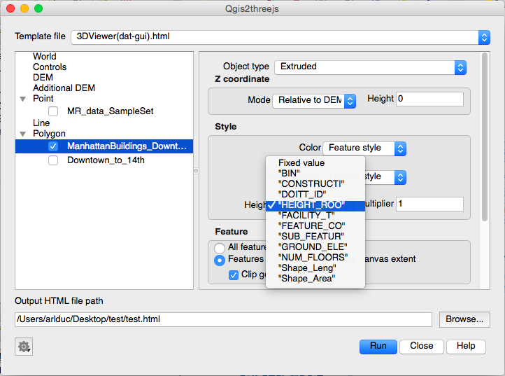
    4. Specify the output file name and filepath. I recommend that you create a new directory for your file, as several supporting files will be generated in addition to the HTML file.
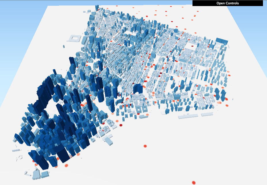
    5. I called my file “test.html.” When I opened it in my browser, it looked pretty good!
      Screen Shot 2015-11-05 at 5.33.31 PM

    Now for a Challenge!

    You’ll notice that the image at the top of this tutorial shows both green dots and red dots, which indicate MindRider “sweetspots” (areas of high relaxation) as well as “hotspots” (areas of high attention). You’ve already visualized the hotspots. Can you visualize the sweetspots as well, and make it so that the hotspots and sweetspots blend together?

    It’s pretty straightforward if you think about it. Here are the basic steps:

    1. Duplicate the MR_data_SampleSet layer. Call it something like MR_sweetspots. For clarity’s sake, re-name your original MR_data_SampleSet to MR_hotspots.
    2. Re-color the MR_sweetspots with a green gradient.
    3. In the same dialog box where you change the layer’s color, you can experiment with Layer Rendering:
      • Try changing the layer’s transparency to 70%.
      • Try changing the layer’s blend mode to Darken or Multiply.

    And see what happens! You can see my version of the sweetspots AND hotspots visualization here.

    + , ,
  • Made in the Machine: New cultural practices, critical analyses, and techniques in digital fabrication, making, and manufacturing Recent innovations in digital fabrication have made its technologies much more cheap, sophisticated, and accessible for people of many ages and experiences. In this class we will explore some of these innovations, the…

    Made in the Machine:

    New cultural practices, critical analyses, and techniques in digital fabrication, making, and manufacturing

    Recent innovations in digital fabrication have made its technologies much more cheap, sophisticated, and accessible for people of many ages and experiences. In this class we will explore some of these innovations, the techniques and affordances that they enable, and the future directions that they imply.

    This will be a project-based class, but as much emphasis will be put on cultural and critical analysis as on technical learning. Class sessions will involve case studies, guest speakers, site visits, and discussion of fabrication methodologies.

    Learning goals:

    1. Learn one or more new digital fabrication technique(s) to understand the experiential context of fabrication. Deliverable: fabricate a simple object.
    2. Examine and critique modes of machine production in a socio-historical setting. Deliverable: write a short research paper or piece of creative nonfiction.
    3. Combine goals 1 and 2 to comment on new and emerging trends in digital fabrication at multiple scales. Deliverable: To be discussed in class.

    Prerequisites:

    An interest in digital fabrication and its impact on the fabric of society. Basic experience with a fabrication technology is recommended, but not required. Examples include:

    • 3D printing
    • Digital cutting (laser, water, etc)
    • CNC milling
    • Digital wire bending
    • Computational sewing or knitting
    • Mass manufacturing
    + ,