Sense & Scale

A site to explore cultures, cities, and computing at varying senses and scales. Updated by Ar Ducao, with content from classes at NYU, MIT, CUNY and more.

Contact: see syllabi

  • Full tutorial coming soon! In the meantime, check the JSFiddle below. This visualization shows the top 2011 NYC baby names by mother’s ethnicity. Background from the D3 API reference and more: bubble chart as a flattened pack layout the pack layout is one of D3’s hierarchy layouts This tutorial is based…

    Full tutorial coming soon! In the meantime, check the JSFiddle below.

    This visualization shows the top 2011 NYC baby names by mother’s ethnicity.

    Background from the D3 API reference and more:

    This tutorial is based on our previous bar chart tutorial, Bostock’s bubble chart example, and InfoCaptor’s Bubble My Page service.

    CSS

    We set up a text size and style for our vis.

    text {
     font: 10px sans-serif;
    }

    HTML

    We include D3.js for the graphics, and Jquery for the rollovers.

    <script src="https://cdnjs.cloudflare.com/ajax/libs/d3/3.5.5/d3.min.js"></script>
    <script src="http://code.jquery.com/jquery-latest.min.js"></script>

    Javascript

    First we set up the global variables for our visualization size, type, colors, and bubbles.

    var diameter = 700,
     format = d3.format(",d"),
     color = d3.scale.category20c();
    
    var bubble = d3.layout.pack()
     .sort(null)
     .size([diameter, diameter])
     .padding(1.5);
    
    var svg = d3.select("body").append("svg")
     .attr("width", diameter)
     .attr("height", diameter)
     .attr("class", "bubble");

    We then query NYC Open Data for the baby name dataset, and throw an error if this query is not successful.

    d3.csv("https://data.cityofnewyork.us/resource/25th-nujf.csv?$limit=10000", function (error, root) {
     if (error) throw error;

    Within the d3.csv function, we set up sub-arrays, divided by ethnicity, to record baby names and related attributes for each ethnicity type (which are pre-determined in the data set). We also set up arrays called data and dobj in which we will concatenate all the sub-arrays.

    //baby names
     var AsianNameList=[];
     var BlackNameList=[];
     var HispanicNameList=[];
     var WhiteNameList=[]; 
     
     //number of babies with name
     var AsianNameCount=[];
     var BlackNameCount=[];
     var HispanicNameCount=[];
     var WhiteNameCount=[]; 
     
     //ethnicity of mother
     var AsianEthnicity=[]; 
     var BlackEthnicity=[]; 
     var HispanicEthnicity=[]; 
     var WhiteEthnicity=[]; 
     
     var data=[]; //3D array of nameList, nameCount, ethnicity
     var dobj=[]; //array formated specifically for hierarchical processing

    We now examine all the names in the dataset and bin them into the sub-arrays. There are duplicate records in the dataset, so we only add the name if it’s not already in the array. We use the “indexOf” function to check if the name is already in the array.

    root.forEach(function (d) {
     if (+d["RNK"] <= 10) {
     
     //only add name if it's not uniquely in the array
     if ((d["ETHCTY"]==="ASIAN AND PACIFIC ISLANDER") && (AsianNameList.indexOf(d["NM"]) ===-1)) {
     AsianNameList.push(d["NM"]);
     AsianNameCount.push(+d["CNT"]); //force the string into an integer
     AsianEthnicity.push(d["ETHCTY"]);
     }
     else if ((d["ETHCTY"]==="BLACK NON HISPANIC") && (BlackNameList.indexOf(d["NM"]) ===-1)) {
     BlackNameList.push(d["NM"]);
     BlackNameCount.push(+d["CNT"]); //force the string into an integer
     BlackEthnicity.push(d["ETHCTY"]);
     }
     else if ((d["ETHCTY"]==="HISPANIC") && (HispanicNameList.indexOf(d["NM"]) ===-1)) {
     HispanicNameList.push(d["NM"]);
     HispanicNameCount.push(+d["CNT"]); //force the string into an integer
     HispanicEthnicity.push(d["ETHCTY"]);
     }
     else if ((d["ETHCTY"]==="WHITE NON HISPANIC") && (WhiteNameList.indexOf(d["NM"]) ===-1)) {
     WhiteNameList.push(d["NM"]);
     WhiteNameCount.push(+d["CNT"]); //force the string into an integer
     WhiteEthnicity.push(d["ETHCTY"]);
     }
     }
     });

    We then concatenate all this data into one array called data. There is some simple test data currently commented out; this can be helpful for if you are having trouble managing your larger dataset.

    data=[
     //test data is commented out:
     //["Tea","Coffee","Soda","Chips","Milk","Chocolate","Beer","Wine"],
     //[130,30,200,40,230,150,80,65]
     AsianNameList.concat(BlackNameList,WhiteNameList,HispanicNameList), 
     AsianNameCount.concat(BlackNameCount,WhiteNameCount,HispanicNameCount), 
     AsianEthnicity.concat(BlackEthnicity,WhiteEthnicity, HispanicEthnicity)
     ];

    We prepare an array called dobj to record the index of each name. We also run the function called display_pack.

    for (var di=0;di<data[0].length;di++) { 
       dobj.push({"key":di,"value":data[1][di]}); 
    } 
    
    display_pack({children: dobj});

    The function display_pack consists of three parts. First, we set up SVG nodes (bubbles): here we set up bubble position, color, and mouseover text.

    function display_pack(root) {
     var node = svg.selectAll(".node")
     .data(bubble.nodes(root)
     .filter(function(d) { return !d.children; }))
     .enter().append("g")
     .attr("class", "node")
     .attr("transform", function(d) { return "translate(" + d.x + "," + d.y + ")"; })
     .style("fill", function(d) { 
     //color is based on ethnicity
     return color(data[2][d.key]); })
     .on("mouseover", function(d) {
     d3.select(this).style("fill", "gold"); 
     showToolTip(" "+data[0][d.key]+"<br> "+data[2][d.key]+"<br>count: "+data[1][d.key]+" ",d.x+d3.mouse(this)[0]+50,d.y+d3.mouse(this)[1],true);
     //console.log(d3.mouse(this));
     })
     //.on("mousemove", function(d,i) {
     //tooltipDivID.css({top:d.y+d3.mouse(this)[1],left:d.x+d3.mouse(this)[0]+50});
     //}) 
     .on("mouseout", function() {
     d3.select(this).style("fill", function(d) { return color(data[2][d.key]); });
     showToolTip(" ",0,0,false);
     });


    Then size our bubbles.

    node.append("circle")
     .attr("r", function(d) { return d.r; });

    Finally, we add text to our bubbles.

    node.append("text")
     .attr("dy", ".3em")
     .style("text-anchor", "middle")
     .style("fill","black")
     .text(function(d) { return data[0][d.key].substring(0, d.r / 3); });

    The function showToolTip is called from display_pack, so we need to write showToolTip. And that’s it!

    function showToolTip(pMessage,pX,pY,pShow)
     {
     if (typeof(tooltipDivID)==="undefined") {
     tooltipDivID =$('<div id="messageToolTipDiv" style="position:absolute;display:block;z-index:10000;border:2px solid black;background-color:rgba(0,0,0,0.8);margin:auto;padding:3px 5px 3px 5px;color:white;font-size:12px;font-family:arial;border-radius: 5px;vertical-align: middle;text-align: center;min-width:50px;overflow:auto;"></div>');
    
     $('body').append(tooltipDivID);
     }
     if (!pShow) { tooltipDivID.hide(); return;}
     //MT.tooltipDivID.empty().append(pMessage);
     tooltipDivID.html(pMessage);
     tooltipDivID.css({top:pY,left:pX});
     tooltipDivID.show();
     }
    + ,
  • Bar charts are some of the simplest forms of visualization and can be a good place to start when making your first vis. Inspired by some of the Socrata and D3 examples, I put together a simple chart showing the daily distribution of my dataset from the SODA tutorial (311 noise complaints, in zip…

    Bar charts are some of the simplest forms of visualization and can be a good place to start when making your first vis. Inspired by some of the Socrata and D3 examples, I put together a simple chart showing the daily distribution of my dataset from the SODA tutorial (311 noise complaints, in zip code 11231, for September 2015). As you can see, most complaints occur on the weekend.

    This chart is based on Mike Bostock’s simple bar chart tutorial, with modifications made to read the relevant NYC Open Data. Like with many of these types of visualizations, its code is written as CSS, HTML, and Javascript. This tutorial assumes proficiency with CSS and HTML, and a basic understanding of Javascript.

    CSS

    In the style section, we set up the fills, strokes, fonts, and shape rendering styles for our bars and axes. We also specify that there will be no x-axis line.

    .bar {
     fill: orange;
    }
    
    .bar:hover {
     fill: lightpink;
    }
    
    .axis {
     font: 10px sans-serif;
    }
    
    .axis path,
    .axis line {
     fill: none;
     stroke: #000;
     shape-rendering: crispEdges;
    }
    
    .x.axis path {
     display: none;
    }

    HTML

    Our HTML body contains only two lines to include the Javascript libraries D3.js and Moment.js. And of course, it contains our custom JS functions, but we’ll discuss that below.

    <script src="https://cdnjs.cloudflare.com/ajax/libs/d3/3.5.5/d3.min.js"></script>
    <script src="https://cdnjs.cloudflare.com/ajax/libs/moment.js/2.10.6/moment.min.js"></script>

    Javascript

    First, we declare and initialize our spatial variables: the margins, width, and height of the vis; the x and y positioning variables, the x-axis and the y-axis, and the SVG (scalable vector graphic) into which we’ll draw our vis.

    Note: I’ll add more detail later about the D3 functions used to initialize these variables, and about the D3 functions used throughout the script. In the meantime, you can start with this info, and you can also drill down into the D3 documentation from Mike Bostock’s simple bar chart tutorial.

    var margin = {top: 20, right: 20, bottom: 30, left: 40},
     width = 960 - margin.left - margin.right,
     height = 500 - margin.top - margin.bottom;
    
    var x = d3.scale.ordinal()
     .rangeRoundBands([0, width], .1);
    
    var y = d3.scale.linear()
     .range([height, 0]);
    
    var xAxis = d3.svg.axis()
     .scale(x)
     .orient("bottom");
    
    var yAxis = d3.svg.axis()
     .scale(y)
     .orient("left")
     .ticks(10);
    
    var svg = d3.select("body").append("svg")
     .attr("width", width + margin.left + margin.right)
     .attr("height", height + margin.top + margin.bottom)
     .append("g")
     .attr("transform", "translate(" + margin.left + "," + margin.top + ")");

    Our remaining bit of code inputs the NYC Open Data csv, parses it, processes it, and visualizes it.

    Input it

    Now we’ll call D3’s CSV function to input our NYC data. Notice that my query from Tutorial 1 has an addition filter: “&$select=created_date.” I added this filter to output ONLY the created_date for each record, because this is the only field that concerns me for this visualization. If there is an issue with the data being read, the “if (error) throw error” will halt the script with an error code.

    d3.csv("https://data.cityofnewyork.us/resource/erm2-nwe9.csv?$where=starts_with(complaint_type,'Noise') AND created_date >='2015-08-01T00:00:00' AND incident_zip='11231' &$select=created_date", function (error, data) {
        if (error) throw error;

    Parse and Process it

    Now we’ll set up an array “week” to represent Sunday (represented as week[0]) through Saturday (represented as week[6]). We will iterate through our NYC dataset with a “forEach” loop, and use the array to count the occurrence of noise complaints for each day.

    This section of code is where we parse each date using Moment.js. Because NYC Open Data is NOT outputting dates in ISO 8601 format, we use Moment to parse the date. We also use Moment’s “day()” function to interpret that date as a day of the week.

    var week = [0, 0, 0, 0, 0, 0, 0]; 
    
    data.forEach(function (d) {
    
    if (moment(d["Created Date"], "M/DD/YYYY hh:mm:ss a").day() == 0) {
     week[0]++;
     } else if (moment(d["Created Date"], "M/DD/YYYY hh:mm:ss a").day() == 1) {
     week[1]++;
     } else if (moment(d["Created Date"], "M/DD/YYYY hh:mm:ss a").day() == 2) {
     week[2]++;
     } else if (moment(d["Created Date"], "M/DD/YYYY hh:mm:ss a").day() == 3) {
     week[3]++;
     } else if (moment(d["Created Date"], "M/DD/YYYY hh:mm:ss a").day() == 4) {
     week[4]++;
     } else if (moment(d["Created Date"], "M/DD/YYYY hh:mm:ss a").day() == 5) {
     week[5]++;
     } else if (moment(d["Created Date"], "M/DD/YYYY hh:mm:ss a").day() == 6) {
     week[6]++;
     }
     });

    I threw in a few debug statements to check the contents of the final array, as well as check the day with the largest number of complaints. If you’re modifying this tutorial with your own data, these debug statements may be useful to you.

     console.log("week:");
     for (index = 0; index < week.length; index++) {
     console.log(week[index]);
     }
     console.log("most complaints in a day:", Math.max.apply(Math, week));

    Note: If you’re using Chrome and running the code for this bar chart as a browser page, you can see the output for these statements in View > Developer > Javascript Console. Firefox and Safari have similar Javascript consoles.

    Visualize it!

    Now it’s time to visualize the array. First, we’ll set up our domains, or the array of values that our axes must span. Domain values will be displayed as labels on our axes.

    • For the y-axis, the domain is from 0 to the maximum value of complaints aggregated from a given day of the week.
    • For the x-axis, the domain is the days of the week.
    y.domain([0, Math.max.apply(Math, week)]);
    x.domain(["Sunday", "Monday", "Tuesday", "Wednesday", "Thursday", "Friday", "Saturday"]);

    Next we will draw the x-axis.

     svg.append("g")
     .attr("class", "x axis")
     .attr("transform", "translate(0," + height + ")")
     .call(xAxis);

    Now we’ll draw the y-axis. We will label this axis “Number of Complaints.”

      svg.append("g")
     .attr("class", "y axis")
     .call(yAxis)
     .append("text")
     .attr("transform", "rotate(-90)")
     .attr("y", 6)
     .attr("dy", ".71em")
     .style("text-anchor", "end")
     .text("Number of Complaints");

    Finally, we will draw a vertical bar for each day of the week. We iterate through the array week for this process.

    • To determine the value of x, we use the index of week to look of the corresponding value of x.domain (which will be Sunday or another day of the week). The position of x is set by its “rangeBand,” which we set up early on in our variable declarations.
    • The determine the value of y, we simply take the value of week‘s element. The position of y is set by the total height of the vis minus the value of y.
      svg.selectAll(".bar")
     .data(week)
     .enter().append("rect")
     .attr("class", "bar")
     .attr("x", function (d, i) {return x(x.domain()[i]);})
     .attr("width", x.rangeBand())
     .attr("y", y)
     .attr("height", function (d) {return height - y(d);});

    Checking and Troubleshooting

    You can fork and fiddle this vis using JSFiddle. Because I will require a standalone file from you for the midterm, it might be helpful to see the vis as a standalone HTML file. You can copy the file to your own server and modify the code with your own data. From there, you can debug and see console statements using Chrome > View > Developer > Javascript Console (if you’re using Chrome).

    + ,
  • Announcements and Links New books and blogs Storefront for Art and Architecture show Visualized Conference Open Society / Knight Challenge Codepen and JSFiddle Networks in Equity and Sustainability Agenda 6:30-7:15: Discussion of NYC Open Data query assignment. 7:15-8:00: Catherine Cramer lecture + Q&A 8:00-8:10: Break 8:10-9:20: Visualization Design Activity: 8:10-8:15: Individual…

    Announcements and Links

    Agenda

    • 6:30-7:15: Discussion of NYC Open Data query assignment.
    • 7:15-8:00: Catherine Cramer lecture + Q&A
    • 8:00-8:10: Break
    • 8:10-9:20: Visualization Design Activity:
      • 8:10-8:15: Individual brainstorming (with post-its, etc).
      • 8:15-8:30: Idea forming in small groups. Diagramming on bigger sheets of paper.
      • 8:30-8:45: Literature search to validate and provide background
    • 8:45-9:20: Brief Presentations

    Notes

    Next Week’s Assignments

    • Blog Post 1, due Sept 24: Visualization of your NYC Open Data. Use Socrata’s example page, the D3 site, and Moment.js to turn your dataset into a simple visualization. You are welcome to use my bar chart tutorial to get started. Post a link to your vis on your blog. We will do a deep dive with these technologies next week.
    • Blog Post 2, due Oct 1: Ideation sketches/pictures from the NYSCI “big data for little kids” exercise, a short bibliography (using MLA citation format) of your scholarly resources, and reflections on the activity. We will revisit this in two weeks.
    +
  • Background   What is Socrata? Socrata is a Seattle-based company, originally founded as Blist in 2007, that has engineered the platform for a number of open government databases, including that of New York, Chicago, Baltimore, the White House, and a number of federal agencies. Socrata catalogs all its open datasets…

    Background


    What is Socrata?

    Socrata is a Seattle-based company, originally founded as Blist in 2007, that has engineered the platform for a number of open government databases, including that of New York, Chicago, Baltimore, the White House, and a number of federal agencies. Socrata catalogs all its open datasets here.
    It also hosts community hackathon sites here.
    SODA = Socrata Open Data API
    SoQL = Socrata Query Language

    Why are we learning Socrata tools?

    Socrata platforms are the gateway to a number of government datasets you may want to use. I also like that the platforms are well-structured, relatively well-documented, and offer an SQL-like query language that can be a good preview to using MySQL and other database packages.

    Do I always have to use SoQL to get Socrata data?

    Not at all! Sometimes a dataset is small enough that you can download it through the Socrata web UI. But in the case that you are dealing with massive datasets like the NYC 311 callbase, you will need to be able to use SoQL to get exactly what you want (unless you want to wait for hours and days to download massive datasets).

    Getting Started: NYC Open Data

    Please peruse the Socrata Open Data API Docs to understand the following NYC Open Data queries. I wanted to query this month’s 311 noise complaints in in my neighborhood (zip code 11231), so I obtained the dataset’s API endpoint, then I modified the format extension to output CSVs instead of JSON, and finally I added filter and query parameters to obtain this month’s noise complaints in 11231.

    Try pasting the following queries as URLs in your browser; for each query, a small a CSV will download to your computer.

    • First, try using a simple filter to get some 311 calls in 11231. The default number of records is 1000, and the default start date is in 2010.
    https://data.cityofnewyork.us/resource/erm2-nwe9.csv?incident_zip=11231
    • I want to start making more complex queries to obtain more recent records just from my neighborhood, so I changed the syntax to the SoQL format.
    https://data.cityofnewyork.us/resource/erm2-nwe9.csv?$where=incident_zip='11231'
    • Then I formed a query to increase the output to 10,000 records:
    https://data.cityofnewyork.us/resource/erm2-nwe9.csv?$where=incident_zip='11231'&$limit=10000
    • And a query for records created on or after September 1 2015:
    https://data.cityofnewyork.us/resource/erm2-nwe9.csv?$where=created_date >='2015-09-01T00:00:00'
    • And a query for noise complaints only:
    https://data.cityofnewyork.us/resource/erm2-nwe9.csv?$where=starts_with(complaint_type,'Noise')
    • Finally, I combined all the previous queries to get exactly what I wanted.
    https://data.cityofnewyork.us/resource/erm2-nwe9.csv?$where=starts_with(complaint_type,'Noise') AND created_date >='2015-08-01T00:00:00' AND incident_zip='11231'


    Now Try It!

    Expand the NYC Open Data exercise by looking at December 2014, the month of protests around Eric Garner’s death. Form a query that outputs a CSV with the following attributes:

    • data source: NYC Open Data
    • time period: December 2014
    • CSV size: smaller than 1 MB

    Start Visualizing

    If you have some visualization experience, you can use the Socrata examples to help you turn your new dataset into a visualization. This will be due in two weeks. If you aren’t there yet, give it a try. I’ll post a brief tutorial on visualizing your data next week.

    And a Handy Thing

    You will probably be using Excel, Google Sheets, Numbers, or another spreadsheet tool to view your data. It can be very handy–especially when you’re annotating your vis or writing a report on it–to know how to put together basic formulas using spreadsheet functions. Since we all have access to Google via our NYU addresses, here are some basic how-tos on putting together a formula using Google Sheet functions:

    + ,
  • Announcements and Links Groups Next week: NYSCI ideation, lit review exercise Punctuality and assignments Agenda 6:30-7:00- Book Club 7:00-8:00- Lecture: Data Vis Toolbox 8:00-8:10- Break 8:00-8:45- Review of class blogs 8:45-9:15: Discussion of spreadsheet functions and database queries 9:15-9:20- Next Week’s Assignments Notes The full Socrata/SODA/SoQL tutorial is now up! Please use it…

    Announcements and Links

    • Groups
    • Next week: NYSCI ideation, lit review exercise
    • Punctuality and assignments

    Agenda

    • 6:30-7:00- Book Club
    • 7:00-8:00- Lecture: Data Vis Toolbox
    • 8:00-8:10- Break
    • 8:00-8:45- Review of class blogs
    • 8:45-9:15: Discussion of spreadsheet functions and database queries
    • 9:15-9:20- Next Week’s Assignments

    Notes

    The full Socrata/SODA/SoQL tutorial is now up! Please use it to complete the assignments below.

    Next Two Week’s Assignments

    • Data Acquisition, required by September 17. Expand the NYC Open Data exercise by looking at December 2014, the month of protests around Eric Garner’s death. Post or send me a CSV with the following attributes:
      • data source: NYC Open Data
      • time period: December 2014
      • CSV size: smaller than 1 MB, if you’re e-mailing it
    • Blog Post, required by September 17. Write a short blog post that contains a link to your CSV if possible, discusses your process, and explains your observations. Also, discuss other data sources you’d like to explore in future classes. Also, post a visualization if you get that far!
    • Visualization, required by September 24. Use Socrata’s example page and the D3 site to start turning your dataset into a simple visualization. If you don’t get that far on the visualization part, that’s ok! We will do a deep dive with these technologies on September 24.
      • If you’re having trouble deciding what to visualize, just try making a simple bar chart of NYC data in December 2014.
    +
  • Now with final projects. In alphabetical order by first author. Good work everyone!   Company Acquisitions (1980-2015) by Hovsep Agop & Sandra Song A Visual Exploration of US Election Project Data by Helen Carey & Sriya Sarkar Major World Locations’ Live Temperature Anomalies by Neill Chua & Patrick Moraitis Beyond…

    +
  • Announcements While you’re waiting for class to begin, please take a look at the links as food for thought. Example Vis: Transit Visualization Client, Conversation Concept Map, MIT ML Pantheon Example Data Source: Socioeconomic Data and Applications Center (SEDAC), NYC Open Data Example application of data visualization: The Next America, The Search for High Energy…

    Announcements

    While you’re waiting for class to begin, please take a look at the links as food for thought.

    Agenda

    • 6:30-7:00- Syllabus Explanation/Discussion
    • 7:00-7:20- Introductions
    • 7:20-8:00- Lecture: A Brief History of Data Visualization
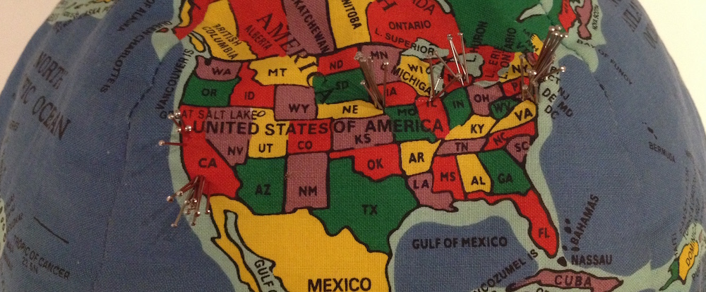
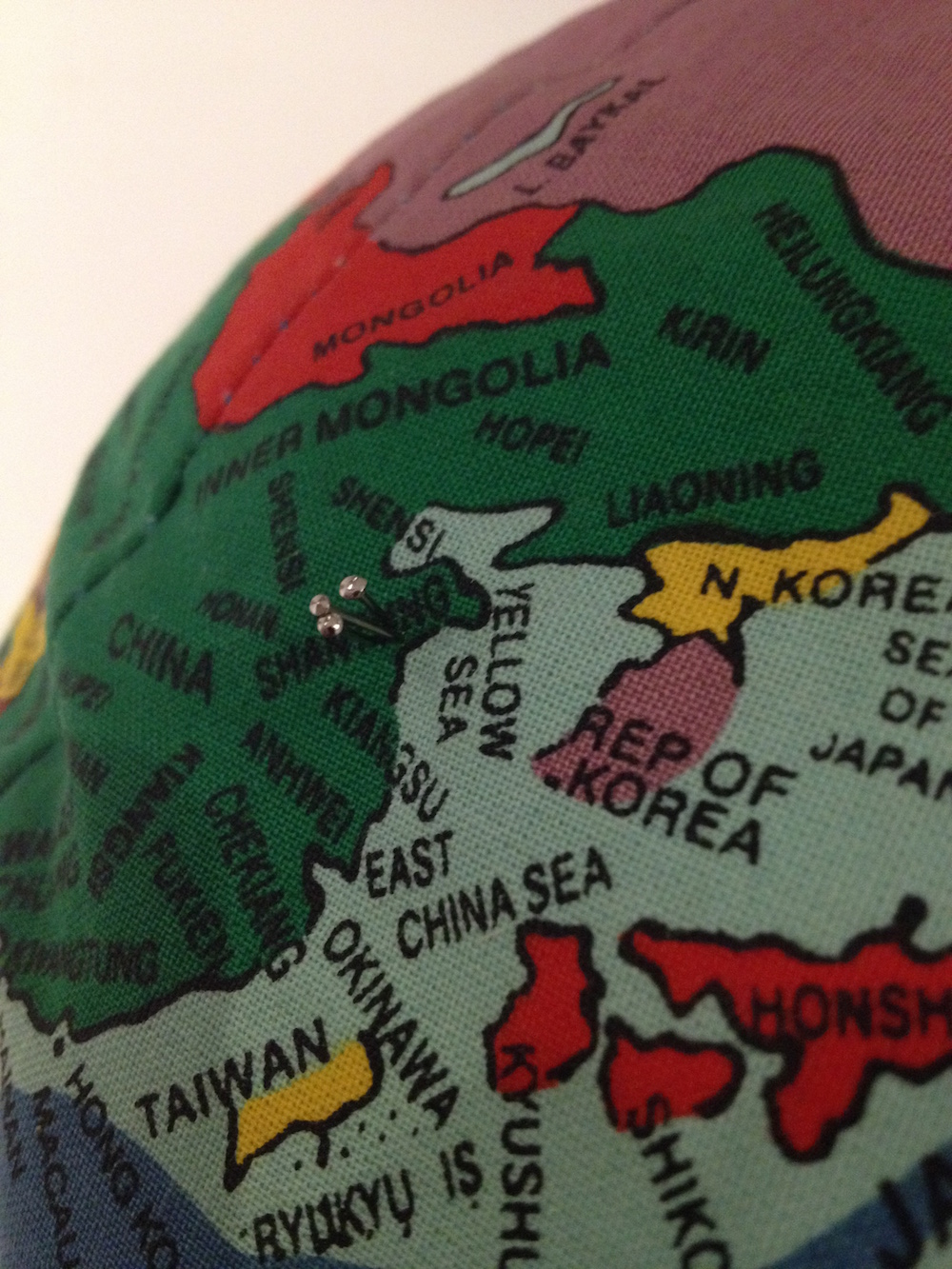
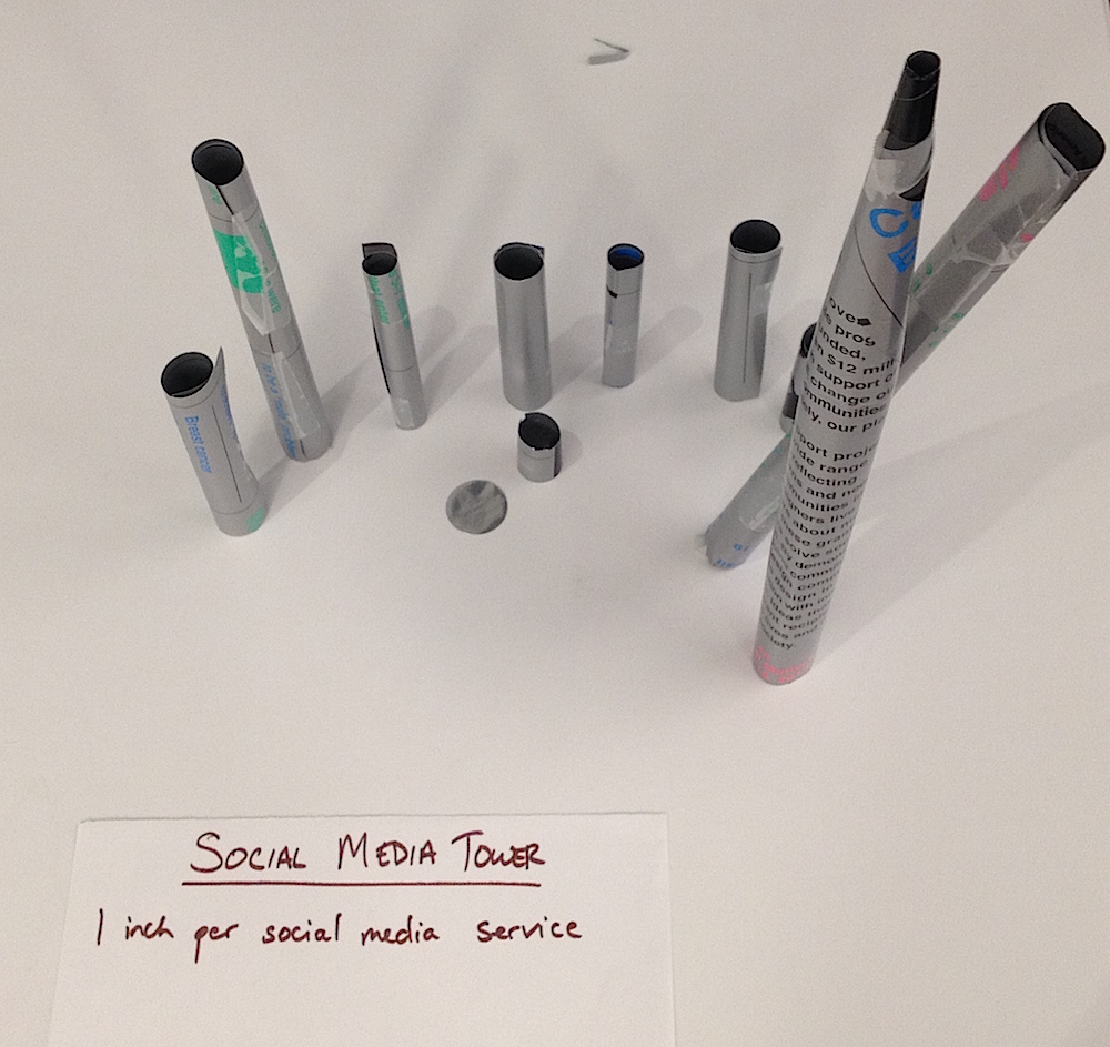
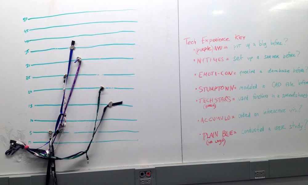
    • 8:00-8:40- Break & Data Vis Sculptures
    • 8:40-8:55- Reconvene
    • 8:55-9:15- Discussion
    • 9:15-9:20- Next Week’s Assignments

    Next Week’s Assignments

    • BOOKS: Go to the library, a bookstore, or an online retailer to get actual, printed book(s) for our DATA VIS BOOK CLUB next week. You can get a recommended book from the syllabus and/or get a book that inspires you. Add your book to this list so we don’t have too many copies of the same book.
    • BLOG: If you don’t have a blog already, set one up. Send me the blog URL. Add a brief blog post that
      • introduces yourself and why you’d like to take this class.
      • includes a link to a data visualization that inspires you. It could be a small visualization that you aspire to make through this class, or a large, long-term team effort. It could be a screen-based visualization or documentation from a tangible visualization (ie a haptic tool or a sculpture). It could be something that you’ve worked on. Briefly describe why it inspires you.

    Notes

    Photos from our Data Vis Sculptures. Captions and more notes to come.

    IMG_4623

    IMG_4627

    IMG_4625


    IMG_4630

    IMG_4638

    IMG_4633


    IMG_4639

    +
  • Data Visualization from 2D to 4D [Screen Graphics to Physical Objects] DM-GY 9103, Fall 2015 Prof. Arlene Ducao, arlduc [at] nyu.edu Thursdays, 6:30-9:20 PM 2 Metrotech, Room 811 Overview What is data visualization? Why and how do we do it? This course will take you through the process of understanding…

    Data Visualization from 2D to 4D
    [Screen Graphics to Physical Objects]

    DM-GY 9103, Fall 2015
    Prof. Arlene Ducao, arlduc [at] nyu.edu
    Thursdays, 6:30-9:20 PM
    2 Metrotech, Room 811


    Overview

    What is data visualization? Why and how do we do it? This course will take you through the process of understanding data visualization role’s in our information landscape, evaluating the kind of data that is best for visualization, and implementing the techniques used to create 2D, 3D, and 4D visualizations. Prerequisites: a basic understanding of HTML, CSS, and one scripting language, i.e. Javascript.

    Learning Goals

    • To understand the history, functionality, and anatomy of data visualization.
    • To classify data and information visualization based on temporal, spatial, tangible, and contextual criteria.
    • To choose and apply the appropriate tools for developing a wide array of basic data visualizations.
    • To plan and execute a complex data visualization project based on audience-centric design principles including significance, relevance, and usability.

    Class Format

    • First part (60-90 minutes): Lecture, discussion, critique.
    • Second part (90-110 minutes): Hands-on building & testing. Early sessions will offer technical how-tos and labs, later sessions will offer open work time for your projects.

    Schedule

    Note: Guest lecturers and critics are subject to change.

    • Class 1: September 3
      • Lecture: A Brief History of Data Visualization.
      • Activity: Introductions and Group Exercise.
    • Class 2: September 10
      • Lecture: Data Vis Toolbox.
      • Activity: Book sharing; Tabular and Query tools.
    • Class 3: September 17
      • Lecture: Catherine Cramer, New York Hall of Science.
      • Activity: Finish Tabular and Query tools; Lit Review exercise. 
    • Class 4: September 24
      • Lecture: Chris Willard, Guidewire Software.
      • Activity: Start brainstorming for midterm.
    • Class 5: October 1
      • Lecture: Catherine D’Ignazio, Emerson Engagement Lab.
      • Activity: Geo-spatial vis tools. 
    • Class 6: October 8
      • Lecture: Ekene Ijeoma, multi-dimensional cartographies.
      • Lecture: Kevin Miklasz, Function vs. aesthetics in data visualization: some case studies.
      • Activity: Student-student critiques and open work time.
    • Class 7: October 15
      • MIDTERM with guest critics De Angela Duff and Holly Orr, NYU.
    • Class 8: October 22
      • Lecture: Bex Hurwitz, Research Action Design. 
      • Activity: Human-centered design exercise (design principles).
    • No Class October 29.
    • Class 9: November 5
      • Lecture: Austin Lee, Microsoft and Carnegie Mellon.
      • Activity: CAD and Motion Graphics Tools. 
    • Class 10: November 12
      • Lecture: Rafi Santo, Mozilla Hive. 
      • Lesson: Kevin Miklasz on R and statistical significance. 
      • Activity: Additional tutorials and troubleshooting as needed.
    • Class 11: November 19
      • Lecture/lab: Richard The, Google and SVA.
      • Lecture/lab: Peiqi Su, NYU ITP.
    • Class 12: December 3.
      • Lecture: Sha Hwang, Healthcare.gov, Gifpop, more.
      • Activity: Prepare for FINAL
    • Class 13: December 10
      • FINAL with guest critics Amy Yu (Viacom) and Birago Jones (Indicator Ventures, UBQ)

    Recommended Tools

    • A tabular software environment (Excel, Google sheet, Zoho sheet, etc)
    • A relational software environment or interface (MySQL, Tableau, SODA)
    • Chrome (for javascript development)
    • Processing
    • A cartographic package (i.e. TileMill, CartoDB, QGIS)
    • Cytoscape or other network graph package (D3 could also work)
    • A free 3D CAD tool (I recommend trying OpenSCAD and TinkerCAD)
    • Quartz Composer (for Mac only)

    Recommended Books (to be discussed in Class 1)

    Foundational Books

    Recent Books

    Office Hours

    Thursday by appointment. E-mail arlduc [at] nyu.edu to make an appointment.

    Grading

    Note: Working in groups is strongly encouraged.

    • 25% Midterm: Demonstration of prototype & two-page paper with MLA-formatted bibliography.
    • 35% Final: Demonstration of prototype & four-page paper with MLA-formatted bibliography.
    • 20% Class participation.
    • 20% Blog posts based on class discussion and project development. At least ten posts are required from the entire semester (five by midterms, five by finals).
    • Encouraged extra credit options:
      • Expanded blogging
      • Video documentation
      • Project web site
      • Conference paper

    Attendance

    Attendance to all class sessions is mandatory. Class starts at 6:30 sharp. Excused absence requests, i.e. for a religious holiday or a conference, must be made at least 3 business days ahead of the scheduled absence. Emergency absences must be accompanied by official documentation, i.e. a doctor’s note or MTA notice. One letter grade drop will occur for every two unexcused late arrivals or one unexcused absence. For additional NYU School of Engineering Academic Policies and Requirements, please consult this link.

    Moses Statement

    If you are student with a disability who is requesting accommodations, please contact New York University’s Moses Center for Students with Disabilities at 212-998-4980 or mosescsd@nyu.edu.  You must be registered with CSD to receive accommodations.  Information about the Moses Center can be found at www.nyu.edu/csd. The Moses Center is located at 726 Broadway on the 2nd floor.
    +
  • It was a beautiful day to be stationed on the 9th floor of NYU’s Kimmel Center. With floor-to-ceiling windows overlooking Washington Square and Chelsea at our backs, each group of our QSAT class presented its final results to guest critics J.D. Godchaux of NiJeL.org and Alyssa Wright of Mapzen. A potluck snack table…

    It was a beautiful day to be stationed on the 9th floor of NYU’s Kimmel Center. With floor-to-ceiling windows overlooking Washington Square and Chelsea at our backs, each group of our QSAT class presented its final results to guest critics J.D. Godchaux of NiJeL.org and Alyssa Wright of Mapzen. A potluck snack table and an additional guest (Clàudia’s friend Nori) added a festive air to the excitement that often surrounds the last day of class.

    As I mentioned at the end of class, I am quite proud of each group’s leap forward in the last weeks and days of class. After midterms, in which most projects were established, and regular check-ins with each group, I thought I knew what to expect for the final presentations, but every group exceeded my expectations. Congratulations to all of this year’s QSAT students.

    In the first half of this semester, the focus was primarily on building technical skills, while in the second half, the focus was on contextualization (background literature review, user studies, persona design). Add to this a guest speaker to spark discussion in each class, and it’s a lot to pack into a semester. I think we had a good balance of topics and a great balance of students, but I think the challenge for me in the next iteration of this class is to think through some sequencing issues: perhaps ask students to build simpler, faster prototypes so that they can collect data over longer periods of time, and cover persona design and lit review earlier in the semester. This could make the start of the semester top-heavy, so it could make sense to have fewer speakers (though I feel that the speakers really help me as an instructor).

    But back to the present. Here are QSAT 2015’s final projects, in order of presentation on April 28. You can review the progression of each project, and my comments on project progress, by launching student blogs from the Class Blogs page.

    RoomSense

    Collective Pulse

    PulseMap

    RailSense (plus post on Persona Exercise)

    Spectral Scan (plus written paper)

    SQUID

    Above: Class photo from finals day. Top, left to right: Changyeon, Bartosz, Michael, Will, Matt, Dimas, Tong, Tanya, Kania, Graham. Bottom, left to right: Greg, Justin, Varun, me, Clàudia.


    + ,
  • Announcements Simband development kits Worst Pothole in Brooklyn Expectations for the final. See assignment below. Next week’s FINAL: Location: Kimmel Center, Room 903 Sign up for potluck here. TODAY’S AGENDA 12:10-12:15: Announcements 12:15-12:35: Colleen Kaman, IBM iX 12:35-12:55: Bex Hurwitz, RightsCon 12:55-1:15: Q&A 1:15-1:25: BREAK 1:25-3:00: Play/user/demo Sessions and work time.…

    Announcements

    TODAY’S AGENDA

    • 12:10-12:15: Announcements
    • 12:15-12:35: Colleen Kaman, IBM iX
    • 12:35-12:55: Bex Hurwitz, RightsCon
    • 12:55-1:15: Q&A
    • 1:15-1:25: BREAK
    • 1:25-3:00: Play/user/demo Sessions and work time. Be prepared to play test, user test, demo, or discuss with Bex or Colleen in the time slot below. When you’re not in a feedback session, please work on your project. You’re also welcome to grab classmates or me for additional feedback.
    1:25 – 1:50 PM 1:55 – 2:20 PM 2:30 – 2:55 PM
    Bex Hurwitz Collective Pulse Spectral Light RailSense
    Colleen Kaman SQUID RoomSense Pulse Map


    ASSIGNMENT FOR NEXT WEEK: Final Presentation!!!

    • PRESENTATION. Please prepare a 10-15 presentation for next week. I will publish a schedule in a few days.
    • DEMO: Weather permitting, we will have a low-key, outdoor demo in the last 30-60 minutes of class, so please bring the technology you have, and try to make it modular. I won’t evaluate you on your project “functionality” during demo time, but it will be great to see, celebrate, and discuss your project in action!
    • DELIVERABLES. Please include in a final post on all of your blogs, due May 1.
      • your slides
      • your write-up, which should integrate these previous assignments:
        • your literature review.
        • your data visualization(s).
        • a reflection on the user/persona design exercise and process (with screenshot of class drawing exercise).
        • please use MLA-style citations (use parenthetical references) and include bibliography in MLA format.
      • a simple electronics wiring diagram
      • optional additional materials (video, photos of your team collecting data, etc)
    • If you’re borrowing any materials from me, you must return them by May 1 in order to receive a grade.
    • EVALUATION CRITERIA [more info here]
      • significance and usability of concept
      • execution of concept (instrument deployment)
      • significance of data (data collection, visualization)
      • how the project fits into “Quantified Self”
      • how the project fits into “About Town”
      • explanation of next steps or future work
    + ,